Prisoner 721

Prisoner 721 by Aaron Lowry


I read this neat little novelette a few weeks back, and figured its merits deserve a shout-out.

Prisoner 721 is, simply put, about a restless inmate who takes it upon himself to teach his prison’s artificial intelligence system how to analyze and interpret visual art.

My favorite thing about this story – what I think makes it – is that it’s told in first-person from the perspective of the AI itself.  Exploring the internalization of a ‘mind’ like this is always a fascinating exercise in thought, and Lowry does a great job of conveying the machine point of view in a unique, believable manner (the “X% chance of Y” trope may be a bit overused, but it has its pulp charm).

The setting, primarily regarding the AI’s role and regulations, is well thought-out, so the scenario evolves in a natural way that doesn’t require sacrificing consistency or technical plausibility for the sake of the plot (a definite plus for any science fiction piece).

It’s a clever, quick, worthwhile read, and you can download it for free on Smashwords, as well as most major eBook retailers.  Check it out!

And take a closer look at that cover – how cool is that?


Bene scribete.

The Tower of Boran – Giveaway

Speaking of giveaways, if you haven’t had the chance to read Shauna Scheets‘s The Tower of Boran yet, you can enter the drawing below to win a free signed copy!


Goodreads Book Giveaway

The Tower of Boran by Shauna Scheets

The Tower of Boran

by Shauna Scheets

Giveaway ends May 20, 2013.

See the giveaway details
at Goodreads.

Enter to win


Want it now?  You can pick up the paperback at most online retailers, or purchase the eBook in all major formats at Smashwords.


Bene Scribete.

Atlanta Nights

I suddenly realized that I haven’t talked about this book, yet.  An unfortunate oversight that I must now rectify, as it is something every aspiring author should read:


Atlanta Nights Cover


The story behind Atlanta Nights is classic.  About ten years ago, a group of thirty-some science fiction and fantasy authors, led by James D. Macdonald, set out to expose PublishAmerica as a non-discriminating vanity press against their claims of being a selective, traditional publisher (partially in response to the firm’s derogatory public statements about the sci-fi/fantasy genres and their writers).  The plan was simple – to create the most magically awful novel ever written, and get PublishAmerica to bite.

Each author, skillfully penning his or her most deliberately atrocious narrative, wrote a single section based on a vague outline, without cross-collaboration.   The result was a glorious disasterpiece.  Chapters repeat or are missing (one is even generated by a computer), the same events recur in different ways, characters change motivation, appearance, and sex, and the plot is wildly incoherent.  When finished, they submitted the compiled manuscript to PublishAmerica under the pseudonym “Travis Tea” (ha-ha) to see if they would accept it.

They did.

A couple months later, the group revealed the hoax to the public.  Conveniently, the very next day, PublishAmerica retracted their offer to publish the book, stating that upon further review, it did not quite meet their standards.  Gee.  (>^-‘)>

Fortunately, the group turned around and published the book on Lulu for the rest of the world to see.  And see it you should.  It’s hilarious.  Each chapter plays up some common mistake, bad writing habit, or other.  It’s effectively a negative blueprint for good storytelling.  A perfect example of everything not to do.  What makes it especially great is that it straddles a line where you can almost take it seriously – we’ve all seen bad but well-intentioned writing – and that gives its absurdities just the right punch.  As they say, “It’s funny ’cause it’s true.”

But I’ve barely scratched the surface of everything that’s so fantastically wrong with this book.  Just do yourself a favor and check it out – your mind may burst, but you might end up a more judicious writer for it.  (>^-‘)>

The paperback is available in the usual places, and they offer the manuscript PDF for free download.


“The world is full of bad books written by amateurs. But why settle for the merely regrettable? Atlanta Nights is a bad book written by experts.”

— Teresa Nielsen Hayden


Bene scribete.

Squares

Shapes and Colors

Or rectangles, anyway


I don’t often talk about the strictly visual, but as an occasional graphic artist, there’s something that’s been grating on my sensibilities.

Is it just me, or is the general design aesthetic of software interfaces aggressively trending back toward blocky, bulky, high-contrast solid-color sterility?  Microsoft’s stuff is heading that way, so is Google’s, and even the Kindle update I got a few days ago turned everything big and square.

Things looked like this in the ’80s and ’90s because of low resolutions, simpler processors, and the fact that having any GUI at all was initially impressive, but have we not grown past this phase?

Did Photoshop disappear when I wasn’t looking, forcing designers to resort to MS Paint?

Does everything have to look like a social networking website?

But on the other end of the scale we have those that are pushing for cheesy skeuomorphism, which just adds a needless layer of nonsense between the user and the task.  I guess there’s no winning, is there?

I thought we had a nice middle ground of rounded corners, subtle gradients, and smooth translucencies.

So I wonder – who is this rectangular regression look appealing to?  It is ‘cleaner’, I’ll give you that, but so is plain text if that’s the only concern.  I suppose there’s nothing inherently wrong with it, but the unavoidable contrast with the elegant designs of yesterday and resemblance to the restricted designs of yestercentury just make it scream “unpolished” to my subconscious.

Any thoughts?  Or am I just being persnickety?


Bene scribete.

Lion-Eating Poet in the Stone Den

A police cop

“Police police police police police police police.”
– Police


Oh, homonyms and homophones.  They let us construct statements such as the above (which, while a ridiculous thing to say, is a perfectly valid English sentence that could be rephrased as “Cops that are regulated by other officers regulate cops that are also regulated by other officers.”).  If you want some extra-specific vocabulary, the noun ‘police’ and the verb ‘police’ are polysemes.

Maybe it’s just me, but I find something inherently humorous about legitimately using the same word (and to a lesser extent, letter) too many times in a row.  You can almost feel the language glaring hatefully at you, like a cop (that may or may not be regulated by other cops) watching a criminal get away on a technicality.

One popular example used to demonstrate the importance of punctuation goes something like “John while I had had had had had had had had had had had proper grammatical structure.”  When we add some orthographic organization, this string of madness actually makes sense – “John, while I had had ‘had’, had had ‘had had’; ‘had had’ had had proper grammatical structure.”

Perhaps the craziest exercise in homophony, however, is the Chinese ‘poem’/riddle by linguist Yuen Ren Chao entitled 施氏食獅史 (usually called “Lion-Eating Poet in the Stone Den” in English).

In its written form, it’s understandable enough (if you know Chinese, anyway):

石室詩士施氏,嗜獅,誓食十獅。
氏時時適市視獅。
十時,適十獅適市。
是時,適施氏適市。
氏視是十獅,恃矢勢,使是十獅逝世。
氏拾是十獅屍,適石室。
石室濕,氏使侍拭石室。
石室拭,氏始試食是十獅。
食時,始識是十獅屍,實十石獅屍。
試釋是事。


It translates to something like:

In a stone den was a poet called Shi, who was a lion addict, and had resolved to eat ten lions.
He often went to the market to look for lions.
At ten o’clock, ten lions had just arrived at the market.
At that time, Shi had just arrived at the market.
He saw those ten lions, and using his trusty arrows, caused the ten lions to die.
He brought the corpses of the ten lions to the stone den.
The stone den was damp. He asked his servants to wipe it.
After the stone den was wiped, he tried to eat those ten lions.
When he ate, he realized that these ten lions were in fact ten stone lion corpses.
Try to explain this matter.


But, when read aloud in (or transliterated from) Mandarin, it becomes practically incomprehensible:

Shíshì shīshì Shī Shì, shì shī, shì shí shí shī.
Shì shíshí shì shì shì shī.
Shí shí, shì shí shī shì shì.
Shì shí, shì Shī Shì shì shì.
Shì shì shì shí shī, shì shǐ shì, shǐ shì shí shī shìshì.
Shì shí shì shí shī shī, shì shíshì.
Shíshì shī, Shì shǐ shì shì shíshì.
Shíshì shì, Shì shǐ shì shí shì shí shī.
Shí shí, shǐ shí shì shí shī shī, shí shí shí shī shī.
Shì shì shì shì.


It’s not perfectly homophonic because of tonal distinctions, but still.  (>^-‘)>  There’s a bit more variation when spoken in the other dialects that use the Chinese ideography (like Cantonese or Taiwanese), but either way, it’s really only followable in writing.


Languages are generally engineered to be as clear as possible, and where they fall short of that goal is something a writer should keep in mind – plus, abusing those problem areas can produce some entertaining results!


Bene scribete.

Font Squirrel

Squirrely


I’m not the biggest fan of squirrels, but…but I do like fonts.

Fonts are important in graphic design work, because writing text by hand is obnoxious and imprecise if you’re not a talented calligrapher.  If you are, then…well…good for you.  For the rest of us, looking for an appropriate typeface can sometimes be a tricky endeavor.

Font Squirrel makes it a little less tricky.  There are a lot of “free” font collection websites out there, but you have to be careful with most of them – a lot of the time what they’ll really indicate is “free for personal use”, which means go ahead and download and tinker around with them, but don’t get caught using them on anything in a professional capacity.  Font Squirrel, however, makes sure to stock only those typefaces which permit commercial usage for free, so you can browse their entire collection without worrying about licensing restrictions.

Fonts are organized by category, and each font has its own page with pertinent stuff, like its character set, example sentences, and even a tryout section to see how your own text looks in it before committing to the download.  For the handful of fonts that aren’t allowed to be re-hosted, a link to the font owner’s website is provided.

Anyway, it’s a handy resource for the budget-minded who get/want/need to design their own covers and promotional materials, and are looking (rightfully so) for a little more flair than the basic operating system defaults provide.  But, please, if you’re also handling the typesetting – for your readers’ sake, don’t get fancy with the interior font.  (>^-‘)>


Bene scribete.

Watch a Writer Write

My good friend Matt Price alerted me to this interesting item the other day:


It’s a screen-capture video Brandon Sanderson (or Branderson, as I like to call him) posted of himself writing his next book in real-time.  You may know Branderson as the famed author of the Mistborn series and finisher of The Wheel of Time.  Although I have yet to read one of his books, I’ve been greatly impressed by the vast amount of well-received work he’s able to put out.

That’s why this video surprises me.  Seeing him in the writing process, it would appear that he is nearly as obsessive, indecisive, and back-and-forth as I am.  This is honestly painful for me to watch, because it’s too much like seeing myself write (complete with cursor-twitching, shunting stuff below, and pre-chapter notes).  I actually had to stop myself from grabbing at the keyboard and mouse to try and make edits to what he was doing.  With his level of output, I expected him to be a draft-blaster who’d zip through and edit later, but now I’m even more amazed with his productivity.  I suppose he did do 400 words in twenty minutes, though, which if a consistent pace would be nothing to scoff at.

Anyway, if you want to see how one prolific author goes about whipping up a draft (or how I do, for that matter), give it a watch.

As a side note, I am pleased to see that he still double-spaces sentences.  Even if he forgot how to spell ‘oar’.


Bene scribete.

Reindeer Drama: Part -1

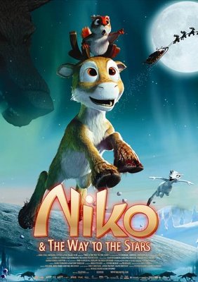
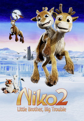
Last month, I talked about a Finnish animated film depicting complicated family turmoil among flying reindeer.  It was a sequel to a movie entitled Niko and the Way to the Stars – one which, after being exposed to the second, I found it necessary to track down.  Having successfully done just that, I suppose it is only appropriate that I should follow up here.


Niko poster


The animation isn’t as sharp as in the second film, but it’s still pretty decent, and the detail they squeeze in despite the low tech is impressive at points.  The English dub is mostly serviceable.  But we’re not here to talk about the technical details…

As you may recall from last time, our little protagonist Niko’s parents have split custody of him in the sequel, and mom shacks up with a new caribou.  This left me with certain expectations of some kind of rocky reindeer divorce occurring in the first.  But the reality, as it turns out, may be even better.

Let’s take a look at the Wikipedia page for Santa’s reindeer.  Niko has an entry on it.  It states, and I quote, that he is:


Prancer’s illegitimate child from a one-night stand with a regular reindeer.


That…is awesome.  I mean, there’s just something kind of fantastic about the blunt, offical candor of a statement like that when considering the subject matter.  And aren’t those links helpful?

So, how do flying reindeer by-blows happen?  When the film begins, Niko is already aware that his father is one of Santa’s crew, but his mother refuses to tell him which one.  She also openly admits to him that she never bothered to tell his dad that he exists.  Real nice.  She explains that she got cozy with him one night when Santa’s sleigh “broke down” nearby (I’ll pause a moment to let you consider what constitutes the ‘engine’ of this particular magical flying sleigh, and subsequently the implications of this claim).  Smooth, Prancer.  Smooth.

Anyway, on to the story.

While gallivanting around in preadolescent reindeerhood, Niko is spotted by a prowling wolf, who naturally wants to turn him into not being hungry anymore.  Niko, being a little reindeer, runs back to his herd for protection.  The wolf, being a predator, follows.  Rather than killing the crap out of this singular wolf, however, the adult reindeer opt instead to run away forever, because apparently they are terrible at being large spiky-headed hoofy-legged animals (there’s a reason wolves hunt lone ungulates in packs).  Since the herd is now displaced, it decides collectively to hate Niko for leading a wolf to its territory.  Since little reindeer don’t like being hated by everyone they know, Niko decides to run away during a snowstorm and track down his father.  Niko’s mother at first wants to go after him, but she is easily talked out of it by another reindeer, deciding that letting her son’s squirrel sidekick try to find him and bring him back safely is good enough.  Reindeer mom of the year.

When Niko finally makes it to Santa’s workshop, he confronts the flying squad in their reindeer tavern (yes, that’s a thing).  When he asks if any of them remember hooking up with a normal caribou one Christmas night, they tell him that he’ll have to be a lot more specific than that.  This means exactly what you think it does.  Santa’s eight are hotshot rock-stars in the reindeer world, and they don’t shy away from picking up a few groupies here and there.  You know, that…actually makes too much sense for raillery.  Niko clarifies his mother’s identity and drops the bomb that one of them is his father, but their response for the time being is feigned ignorance and wholehearted denial.  Why does nobody want this adorable little reindeer kid?


RNDR FCE!!!

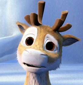
That face. It’s glycerin.


Let’s talk about the villain.  Ooh, let’s!

He is the leader of a pack of wolves who’ve fallen on hard times.  His goal is to eat Santa’s reindeer.  Because – are you ready? – he believes, for no discernible reason, that doing so will grant him their ability to fly.  And then.  He aims to eat Santa Claus himself.  And then.  He intends at last to take Santa’s place so he can FLY AROUND THE WORLD AND EAT EVERY CHILD EVER ON CHRISTMAS.  I–ghh–bvv…  This is possibly the best and most insane motivation I have ever seen for an antagonist in a Christmas or children’s movie.

Then, there is a pink poodle who is inexplicably lost and on her own in the north pole, and even more inexplicably knows the way to Santa’s secret workshop.  She runs into the wolves and they make her lead them there.  The one semi-intelligent non-jerk wolf in the group, likely realizing his pack is entirely male, runs off with her.  Now I want to see what a woodle (a poolf?) looks like.

I could go on, but there’s simply too much and I can’t describe it all coherently.  Just find it and watch it.  It’s madness.  In the meantime, I’ll leave you with seven more things you should know about Niko and the Way to the Stars.


  • Niko is the same size and seems to be only slightly younger in this than he is in the second, which takes place at least a year later.  I’m guessing this is because, as the son of Prancer, who is ostensibly immortal, he ages much more slowly than a regular caribou would.
  • The ermine randomly breaks out into song in this one, and is generally psychotic.  I guess they dropped that particular direction for the second.
  • Why is Vixen male?  At least Donner and Blitzen have German accents.
  • Niko’s squirrel morbidly creates snowsquirrels of his wife and kid to keep himself company, because the real ones were eaten by wolves.
  • The gateway cave to Santa’s workshop is a perilous Indiana Jones-style death trap.
  • At one point, when Prancer gets knocked out, the squirrel sodomizes him with an icicle to wake him up.
  • Toward the end, Santa’s reindeer warp into outer space with the wolf leader, and then drop him from orbit (maybe that’s the way to the stars?).


Bene scribete.

Reindeer Drama

So the other day at my sister’s place, while scrolling through Netflix in search of something ridiculous to watch, we stumble upon this curious item:


Niko 2


We initially click on it because we think we’re looking at a two-headed reindeer (alas, it was only a small reindeer being ridden by a smaller reindeer).  But then.  But then!  We read the description:


On Christmas Eve, young reindeer Niko’s world seems shattered after his mother remarries and he’s blamed when his new stepbrother is kidnapped.


I don’t even…  Reindeer drama?  What?  How could we not watch this?

Anyway, it gets better.

It turns out that the eponymous Niko can fly because his real dad is Prancer.  Prancer.  Do you get what that means?  One of Santa’s magical caribou couldn’t make his reindeer marriage work, and is now an every-other-weekend dad.  I can’t get over how starkly…modern that notion is given the context of a kids’ Christmas story about flying reindeer.  And the giant “2” on the cover tells us there was a movie before this one – was it about little Niko suffering through his parents’ (one of whom, once again, is Prancer!) messy reindeer divorce?  I like to imagine so.

The movie begins with Niko returning home from a visit with his dad to find that his mother has shacked up with her new cari-beau (…O.K., that was awful).  If that weren’t enough to dump in a kid’s lap overnight, the new guy has a younger son of his own, and mom is already pregnant with another.  Yet this isn’t even a wicked stepparent thing – the stepdad is a really nice guy.  Am I seriously watching a mature portrayal of split-family dynamics in a reindeer cartoon?

Niko himself is grudgingly adorable (even with his strangely reptilian nose).  You’d think, being the only flying reindeer in his herd, that he’d be a typical acceptance-craving misfit protagonist.  But, no.  Enjoying solitude, he envies the life of a hermit he meets, and actually utters, in chipper earnest, “I wish that nobody knew I existed.”  Yikes!


Some reindeer

That’s pretty f-d, kid


The central conflict is mostly forgettable (aside from its own strangeness), involving a wolf who for some reason lives in a high mountain cavern with a bunch of eagles who for some reason carry her around and are her devout servants.  This wolf, we learn, wants revenge on Niko for apparently having killed her brother in the first film (I presume as a way to lash out against his parents’ split-up).

The film is Finnish, and while the visuals were expectedly not on par with the Pixar/Dreamworks standard, I’d place them only one tier down.  There was some interesting detail (the reindeer, while still hyper-cute-ified, looked more like actual caribou than any other animated reindeer I can think of), the wingless flight physics were oddly amusing, and the mouth-sync looked to be re-rendered for the English dub.  No one could seem to agree on how to pronounce the names, though.

I’m not sure where I’m going with all this; I suppose I just enjoy incredulity.  So should you watch this thing?  I don’t know.  But yes, you probably should.

I’ll leave you with five more things you should know about Niko 2:

  1. I feel like it takes place in a world where humanity has disappeared, but the reindeer have taken over running Santa’s shop because they don’t know any other way of life.
  2. When you finally do see Santa, he is wearing a starry-night cape.
  3. There is an ermine (not a particularly endearing ermine, but an ermine nonetheless).
  4. For some reason, Niko learns how to go starship-style warp-speed at the end.
  5. All of this is about an animated kids’ magical flying talking Christmas reindeer movie that was actually made, and exists, here on Earth, in this reality.


Bene scribete.

Letter Palettes

A while back, I talked a bit about what you might consider when naming characters, and today I thought I would follow up by expounding specifically on the topic of pulling words out of your—well, making them up.

Letter Palette

Uh…


When concocting names for characters, places, or objects, we tend to favor certain sounds.  Where we gravitate is mostly informed by the language(s) we speak, and what we’ve come to associate with pre-established words and names.  Certain phonemes build specific impressions in our minds, and we rely on this context to put together fitting verbal symbols for whatever we’re assigning them to.  Whether or not this is typically done on a conscious level, identifying and mapping out your preferences (both general and circumstantial) can be a useful endeavor.

For instance, my general letter palette would look like this:


+

\

A C D E I K L M N R S T J O Q V X Y Z B F G H P U W


The first column represents what I feel are the most benign letters, and I use them fairly indiscriminately.  The second contains letters that I like at certain times, but aren’t as ubiquitously usable.  The third holds the letters that I tend to avoid.  When my intent is to give a name a rough or unpleasant edge, however, these preferences easily operate in reverse.  The initial and terminal letters of the word will be particularly prone to these guidelines.

Now, this chart is pretty simplistic, containing only letters from the English Roman alphabet and not taking digraphs into account, but you get the idea.  I’m calling it a letter palette (as opposed to a simply phonetic one) because visual aesthetics are also a consideration – sounds can often be written a number of ways, and their appeal can be tweaked as such.

Making a general purpose palette for yourself can be an enlightening exercise, but they become particularly handy when tailored for specific sets.  If, for your story, you need to create a distinct culture with its associated terminology and members’ names, planning out a letter palette for it can help you quicken the process while maintaining a consistent feel.


So, do you find yourself with particular letter preferences?  Could you define your own general palette?


Bene scribete.